Brand Guidelines
We take great care in the development and protection of our trademarks and reserves all rights of ownership of its trademarks, including but not limited to PHOTODAY, FACEFIND, ADVANCE PAY, and all related logos.
Use of PhotoDay’s trademarks without express permission or license is limited to text-only references to PhotoDay or its product and service names, and excludesany and all use of PhotoDay’s logos. In referring to PhotoDay or its products or services by name, you must be clear and accurate as to the nature of the relationship between PhotoDay and your company, its products, and its services. You may not use PhotoDay’s trademarks in a manner which could cause confusion as to PhotoDay’s sponsorship, affiliation or endorsement.
Beyond this, all other use of PhotoDay’s trademarks and any use of PhotoDay’s logos or other branding elements requires our prior written consent and is subject to PhotoDay's Marks Usage Agreement.
The following guidelines are designed to ensure that the authorized use of thePhotoDay® brand is represented consistently in all communications in its intended use. When using the PhotoDay logo, it is important to use the assets as directed and approved in this guideline and pursuant to PhotoDay's Marks Usage Agreement.You can find the assets for download in the Logo Versions section of this page.
Logo Version
EPS and PNG versions of the PhotoDay logo are available for use on webpages, mobile applications, or in printed materials. If the available logo versions won't work for a project, as in the case of a large sign or billboard, new artwork should be commissioned at the proper scale. There should be no deviation from these rules without authorization from the marketing department of PhotoDay.
The colored logo works best on light backgrounds; the white one is designed for dark backgrounds.


The following are the different versions of the "Powered by PhotoDay" logo. This logo is mostly used on marketing materials that promote a PhotoDay gallery.



Logo Size & Visibility
The logo should be used independently, and should not be combined with or crowded by other graphic images. It is essential to follow the minimum size and safe guidelines to ensure legibility and consistency of the PhotoDay logo.
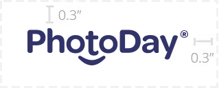
To maintain the visibility of the logo, there bust be a surrounding clear area of 0.3 inches. This area must be void of any text or graphics.

To ensure legibility, the height of the logo should never be reduced any shorter than 0.5 inches.
Logo Missuse
The logo should always be used in its entirety. Also, be sure to use the proper proportions, orientation, fonts, and colors. The logo should never be distorted, skewed, blurred, altered, or otherwise adjusted. The following illustrates ways in which the PhotoDay logo should never be treated.


